

Brand Core

The brand attitude of Padel-Point – identity, values and derivation logic.
01
Brand Essence
Padel-Point defines Padel as an urban sport with a social core and athletic ambition.
Self-Understanding
Padel-Point understands Padel as an independent sports culture born from dynamics, closeness and game intelligence. The brand's character is not formed through products or staging, but through the game itself, the space in which it takes place, and the people who play it together. Padel-Point shows Padel as it is lived – direct, accessible and athletically credible.
Attitude
- Direct – no detours, no glorification
- Accessible – for everyone who wants to play
- Athletically credible – ambition without elitism
Core Statement
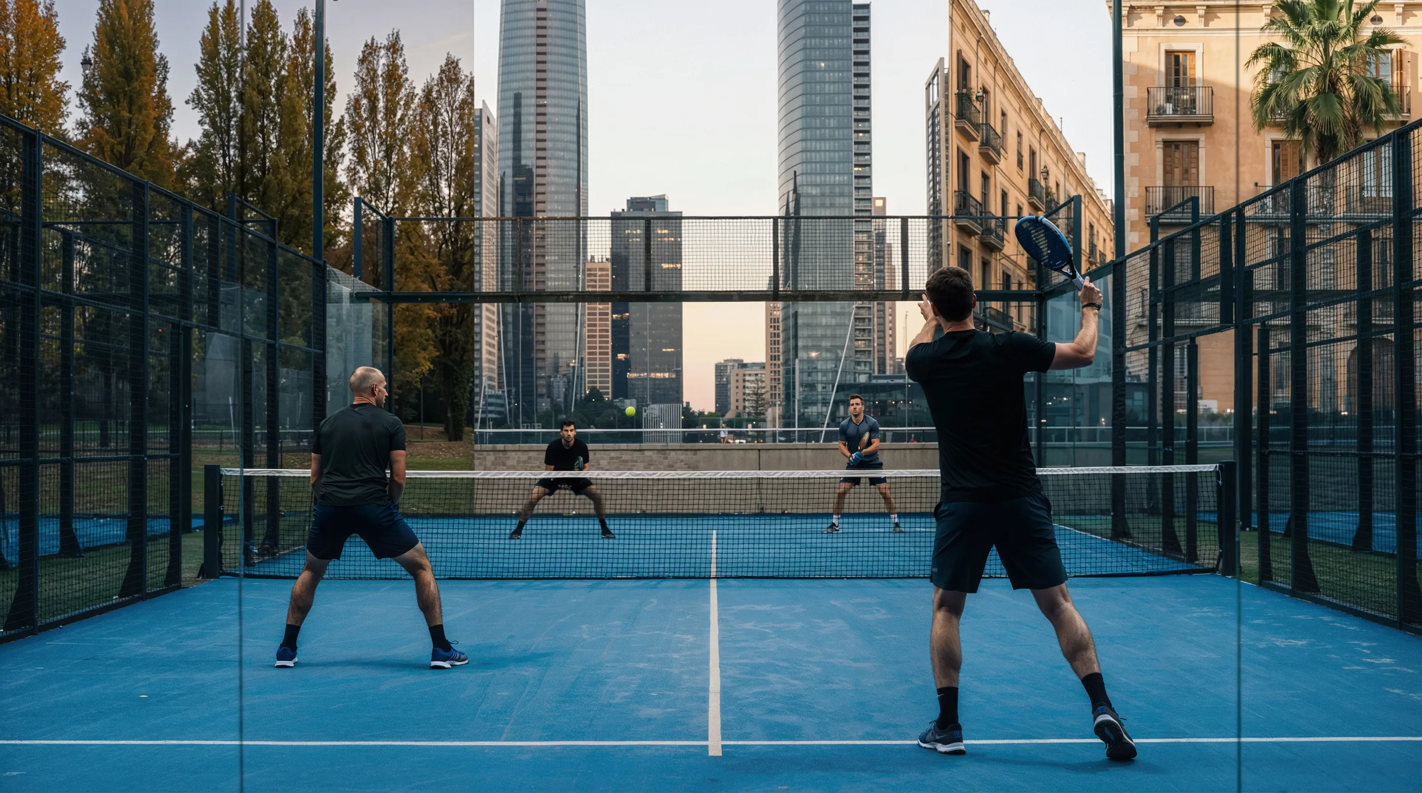
The game is the starting point. Not the idea of it, not the surroundings – but game situations, game moments, game emotions.
02
Brand Attitude & Tension Fields
Performance and community are not contradictory. Padel-Point positions itself between poles – never at the extreme.
| Pole A | Padel-Point | Pole B |
|---|---|---|
| Exclusive | Accessible, not cheap | Mass market |
| Performance focus | Athletically credible, not elitist | Lifestyle focus |
| Individual sport | Community-driven, not casual | Party sport |
| Traditional | Progressive, not trendy | Trendy |
Athletic Credibility
The game determines the expression. Aesthetics, impact and visual presence derive from the game. What becomes visible emerges from movement, interaction and game situations.
Community Spirit
Padel thrives on doubles. The team is part of the identity.
Accessibility
Padel-Point is for everyone who wants to play – regardless of level.
Urbanity
Padel is a sport of the cities – fast, direct, contemporary. Athletic utility, game reality and space determine the brand's attitude.
03
The 6 Brand Anchors
Stable reference points from which all expressions derive. Identity-forming, non-negotiable.
Game Focus
The game is the starting point.
Padel-Point shows preparation, anticipation and transitions between actions. Emotion emerges in the game – not through staged victory gestures or solo hero moments.
Space
The court defines the space.
Glass, grids, lines and boundaries create closeness, clarity and spatial density. Even in open environments, the court remains the central stage of the game.
Community
Community is part of the game, not its backdrop.
Closeness, interaction and team dynamics are part of Padel's game reality. Community is present without being staged. The togetherness – not the lone fighter – shapes the visual language and tonality.
Look & Performance
Performance shapes the look.
Athletic ambition is visible – in body tension, movement, concentration. The visual impression follows athletic use and game context. Authenticity and signs of use are part of the brand reality.
Reduction
Reduction creates clarity.
The brand communicates clearly and directly. No detours, no obfuscation. Fugaz One as headline typeface embodies this attitude typographically. Padel-Point avoids visual loudness and decorative overdesign.
Accessibility
Padel is for everyone who wants to play.
Padel-Point stands for openness – regardless of level. The sport is accessible, so is the brand. It doesn't exclude, it invites.
04
Brand Promises
The brand anchors describe the attitude. The promises translate it into a concrete customer promise: short, binding, instantly clear.
100% Padel
No tennis range with a padel corner. Padel only, from rackets to court equipment. Every product deliberately picked.
Easy to start
Test rackets, personal advice, starter sets. Anyone who wants to try padel gets in right away.
Fast delivery
Fast shipping, easy returns, pickup in 30+ stores. The full logistics power of Tennis-Point, focused on padel.
Application: name it or theme it
Not every surface names a promise. Two cases, one guardrail.
Naming surfaces
POS headline, landing hero, brand statement. Here the promise stands as a statement, use the customer claim verbatim, don't rephrase.
Conversion surfaces
Shop USP bar, flyer, checkout. Here a concrete feature may replace the claim when it converts better: “Try rackets before you buy” instead of “Easy to start”.
Guardrail: every point must trace back to exactly one of the three promises. Theme it, don't invent.
Do
- “Try rackets before you buy” traces back to Easy to start. Works.
Don't
- “Top brands. Top deals.” traces back to no promise and is a superlative without substance. Out.
Example: Discount surface
A discount needs an object. The percentage alone doesn't say what it applies to or that Padel-Point is the shop for it. Pattern: discount + concrete categories + anchor on 100% Padel.
10% on rackets, balls, apparel. All padel.
05
Claim: Raise Your Game
The condensed brand attitude in language form.
RAISE YOUR GAME
Raise Your Performance
Push your limits on the court. Every session is a chance to get better. That's the mindset.
We Raise Your Game
Padel-Point as a brand that elevates your play: with the right gear, the right advice, the right standard.
Level Up, Don't Watch
Don't stand on the sideline. Step on the court. Raise your game, starting now.
Application Logic
RAISE YOUR GAME belongs in brand contexts – not in product or informational contexts.
| Context | Use | Rule |
|---|---|---|
| Campaign Closer | Yes | Standard ending after headline |
| Social Media Bio | Yes | Fixed element |
| Retail / Store (Impulse Zone) | Yes | As statement element, Fugaz One large |
| Venue Wall | Yes | Claim alone, WITHOUT logo: the space is the brand |
| Banner on Cage Grid | Yes | Logo LEFT, claim RIGHT (horizontally separated, never stacked) |
| Merch (T-Shirt Back) | Yes | Fugaz One, uppercase, white on black |
| Product Descriptions | No | No claim in product or informational contexts |
| Technical / Legal Content | No | No claim |
| Glass Surfaces | No | Not on clear glass: too much visual weight, contradicts reduction. An opaque vinyl band in a system colour is a carrier of its own and counts as a banner. Court glass walls stay free of text |
Claim No-Gos
- No logo lockup: claim always stays separate from the logo
- Never place claim on clear glass: too much visual weight, contradicts reduction. An opaque vinyl band counts as a carrier of its own (like a banner); the claim then sits white on black on the band
- Claim never larger than logo: where both appear, the logo dominates
- Claim + functional tagline never at the same touchpoint: either RAISE YOUR GAME or 'Germany's #1 Padel Shop'
- No claim variations: no 'RAISE OUR GAME', 'RAISE THE GAME', 'RAISE MY GAME'
- Vertical logo + claim stacked below is forbidden: creates wall of text
- Never without logo on portable banners: logo accompaniment mandatory outside own spaces
- No permanent floor marking: RAISE YOUR GAME on court floor only temporary at events
- Never parody the claim: humorous contextualization yes, parody no
Typography & Variant
RAISE YOUR GAME
Always Fugaz One, always UPPERCASE, including activations. No other typeface, no other casing.
CTA Variant
RAISE YOUR GAME
State: the standard you hold yourself to
RAISE YOUR GAME
Call to action: step up now
RAISE YOUR GAME is the activating variant for campaigns and events.
06
Derivation Logic
Every design decision must derive from a brand anchor.
Which anchor does this decision derive from?
If the answer is unclear or 'it looks good', the decision is not brand-compliant.